Why Coca-Cola’s FIFA 26 campaign feels different
Every World Cup attracts the same procession of sponsors. Logos appear where they’re expected, products receive commemorative packaging and advertising reaches fever pitch before quietly disappearing from memory.
Coca-Cola has taken a different approach. Rather than creating a temporary identity for FIFA 26, it has used the tournament to reinforce what already makes the brand unmistakably Coca-Cola. That’s an important distinction because memorable branding rarely comes from constant reinvention. More often, it comes from expressing familiar brand assets in fresh, relevant ways.
Brand consistency wins
Many event campaigns look spectacular but contribute little to long-term brand recognition. Coca-Cola instead builds on decades of visual equity. The iconic red, Spencerian script and dynamic ribbon remain central to the campaign, providing immediate recognition while allowing new creative ideas to sit comfortably within an established identity.
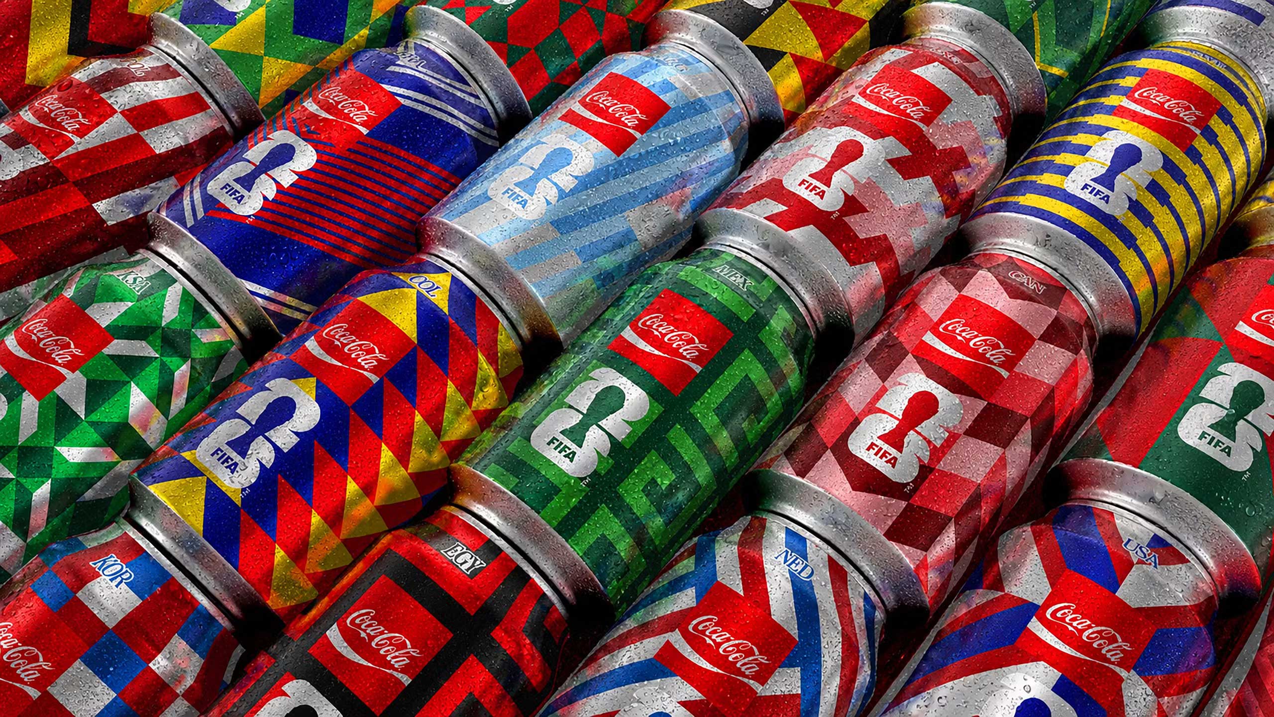
The geometric packaging system is a particularly clever addition. Inspired by the colours and energy of competing nations, it celebrates football’s tribal nature without fragmenting the brand. Every can feels unique, yet each clearly belongs to the same visual family. Rather than producing dozens of disconnected designs, Coca-Cola creates variation from a single visual language. That’s what strong design systems do: they provide flexibility without sacrificing consistency.
Design influences behaviour
The campaign also demonstrates that branding is about more than visual identity. The “Collect The Whole Squad” concept transforms packaging into something people actively engage with. Rather than simply buying a drink, consumers are encouraged to collect, compare and share, extending the campaign beyond advertising into everyday behaviour.
Equally effective is the decision to focus on supporters rather than football’s biggest stars. The photography captures celebration, anticipation and shared emotion instead of perfectly choreographed sporting moments. It feels authentic because it reflects how most people actually experience major tournaments: through friends, family and shared memories.
Systems outperform campaigns
Perhaps the campaign’s greatest strength is that it functions as a complete design system rather than a collection of individual assets. The geometric patterns, ribbon device, typography and colour palette translate seamlessly across packaging, merchandise, digital platforms, stadium graphics and out-of-home advertising. Remove any single execution and the wider identity remains intact.
That matters because modern brands exist across countless touchpoints. Strong identities are designed to adapt while remaining instantly recognisable, ensuring every campaign strengthens the same mental picture instead of replacing it.
A lesson beyond football
The FIFA 26 campaign succeeds for reasons that have little to do with football itself. It demonstrates that successful branding isn’t about creating something entirely new every time an opportunity arises. It’s about evolving recognisable assets in ways that feel fresh while remaining unmistakably true to the brand.
For designers, that’s perhaps the most valuable takeaway. Originality has its place, but distinctiveness is what builds lasting brands. Coca-Cola’s FIFA 26 campaign is a reminder that great branding isn’t built through constant reinvention. It’s built through thoughtful consistency, with every campaign making the brand a little stronger than the last.